GB Pixel Art Jam 2024 Submission - Fractum Statera
A downloadable Pixel Art
This is my pixel art made for GB Pixel Art Jam 2024.
Theme: Color
About the theme: Jam participants would have to choose between 4 palettes of 4 colors each, they were:


Pixel art has 4 colors and 192 tiles of 8x8 pixels
Chosen palette: Blood Tide
The colors are: #fffeea; #7a968d; #394a5a; #652121.
The use of the palette:
When I had participated in the last Pixel Art Jam, I was focused on how to interpret that year's theme. It was something that fit me like a glove, because I could easily identify something that represented that idea well. Now, in this edition, I was quite restrained about what I really should represent. "Color" didn't sound like a theme to me at first, it just seemed like a momentary excuse to add colors to this year's Jam. So I spent a month waiting for the event thinking about it.
It was on October 4th, the palettes were revealed, and I had an idea of what this edition should be. I could see the 4 color palettes that carried their own idea and with multiple concepts, and I could finally start my art.
However, time passed, and no original idea came to my head. It had been 24 hours since the beginning of the Jam and I had only spent hours with a blank screen, without a single pixel in a resolution of 160x144. I was quite confused about what I really wanted to do with this theme. At first glance, I had been interested in the "Mangavania" color palette, but I've never been that good with Pastel colors, so it would be an out-of-the-box experience. But the more I asked myself why I wanted the Mangavania Palette, the more I wondered why I rejected the other options. The answer was simple, the other palettes complemented each other in an analogous contrast, Mangavania was a complementary palette and would not necessarily complement its colors, that would depend on the artist. I wanted this type of palette and only two followed this logic, 04 and 01. Well, here I finally get to Blood Tide.
The first time I saw the Blood Tide Palette, I didn't like it very much. The name seemed strange to me for a Jam with a clear rule about NSFW, and the situation was worse when that was the only description of the palette. It's as if I technically couldn't describe my own chosen palette. The other reason I didn't like the palette was the colors that were chosen. In short, the colors didn't match very well. The color that should have been the darkest (red) was actually a light and strong tone that didn't match the blue tones at all (which, by the way, the dark blue in the palette was even darker than the red). It's as if they objectively didn't want to use the red tone as the dominant color in the image, unless you wanted an image that would burn your eyes.
This was definitely strange, so I decided to research the palette, and soon discovered the little story behind it. The palette had been created to pay homage to Ben Jelter's game "The Machine", but this idea seemed strange. The game was made for the Game Boy Color, and it didn't use just 4 colors in the palette, much less just one shade of red. This goes even further, because the colors didn't seem to have been taken directly from the game, the red should have been a much darker shade, something close to #593c4a. It was then that I decided that this palette wasn't a good idea for me, and I had turned down the chance to use it in my pixel art.
Time passed, and it was only 12 hours now. I still had a simple idea, but I didn't know how to complement this image. It was then that against all my will, I decided to give in to the color palette that I had turned down. I decided to give it a chance and prove to myself that I was wrong about my ideas. It was then that I decided that this would be my palette, and finally the art began to be made.
About Pixel Art:
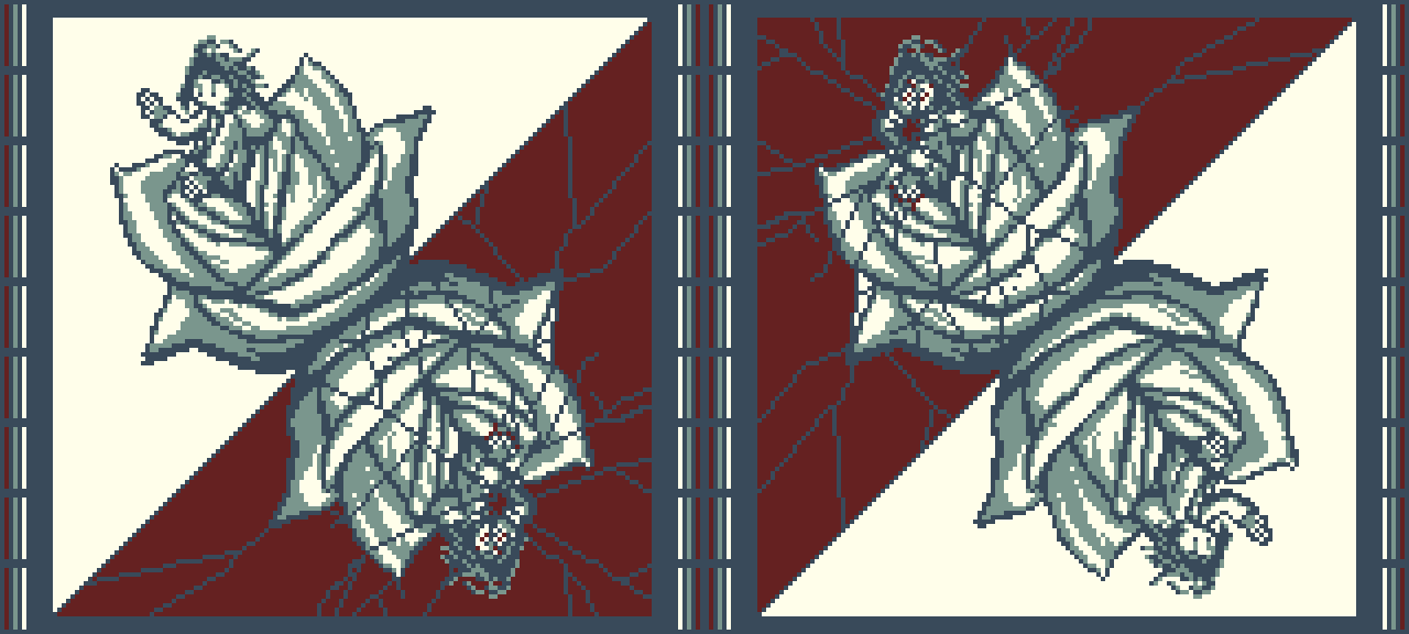
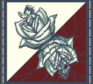
A blooming flower reveals a person, this person seems curious about the world around him. The reflection of the flower is represented at a 45 degree angle, its reflection reveals a distorted and red landscape. The person no longer arouses curiosity.
I felt like trying a strange combination, a mix of the wet concept seen in watercolor and the concept of thick, curved lines seen in stained-glass. In fact, the intention was to follow the style of art seen in stained-glass. This was designed to directly impact the reflection, which the "wet" concept would be filled with the red colors that would run through the entire stained-glass window.
While I was drawing I tried to interpret the palette idea once again, and this made the art more tense than I wanted. The simple idea I had was that the red color represented a "distortion" of the reflection. In the original image, the red color ran through the entire flower, sneaking through the cracks. However, this had become a bit too graphic and out of respect for Pixel Art Jam I ended up having to discard this version. This made me have to spend more time redrawing the art concept and creating a new concept. In the end, there was only less than an hour left for the Submission to be uploaded (which explains the "1 minute, 1 second before the deadline").
I only had problems with the tile limit when creating the reflection cracks. Apart from that, the drawing was very functional for me.
But overall, I think I learned a little more about representing gestures with just a few pixels. And I liked having resolved my differences with the Blood Tide Palette.
Download


Comments
Log in with itch.io to leave a comment.
Hi, I was checking if you joined '25 edition. I've just read the message on your profile, I wish you the best. Take care, see you!
This page alone deserves praise. I love when artists tell the stories behind their artworks, sharing their experience.
These colors and shapes feel very solemn.
This art brings back the memories of when I used to go to church. The quiet atmosphere, well-dressed people, the sunlight shining through the colored glass windows, the dim lights of candles, the smell of incense... a magic mix that sometimes I miss.
Keep up the good work! See you again in the next jam!
Thank you very much for checking out my submission this year. I also love hearing the stories behind each pixel art. I saw that many users who didn't do it last year ended up doing it this year.
About the stained-glass style, I was very inspired by the ones I saw in some Gothic churches I've visited. Since most of them were Catholic churches, it was quite common to see images of angels or people being illustrated in the stained-glass windows, but when that wasn't the case, they were usually flowers. I chose flowers because they would be easier to identify in the art (besides, I'm not very good at drawing humans).
I hope to see you next year too! Good luck!
I'm glad you went with the blood tide palette - it works really well for this piece!
Thank you very much! I had a lot of doubts about this color palette, I'm happy to know that you liked it.
This looks so good!!
<3